Process Post - Materials I use

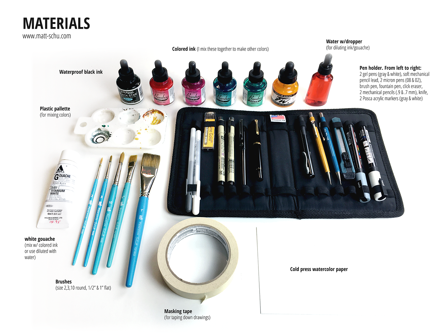
I’m always curious about the materials other artists use, so I put together this post of my materials (scroll down to see pics). Generally speaking I use pens & ink & gouache on watercolor paper. I mix the ink in a palette and dilute with water to change the opacity/intensity of the colors. I try to keep my setup as portable as I can, so — other than the bottles of colored ink and the varnish — I carry all of this with me in my backpack wherever I go.

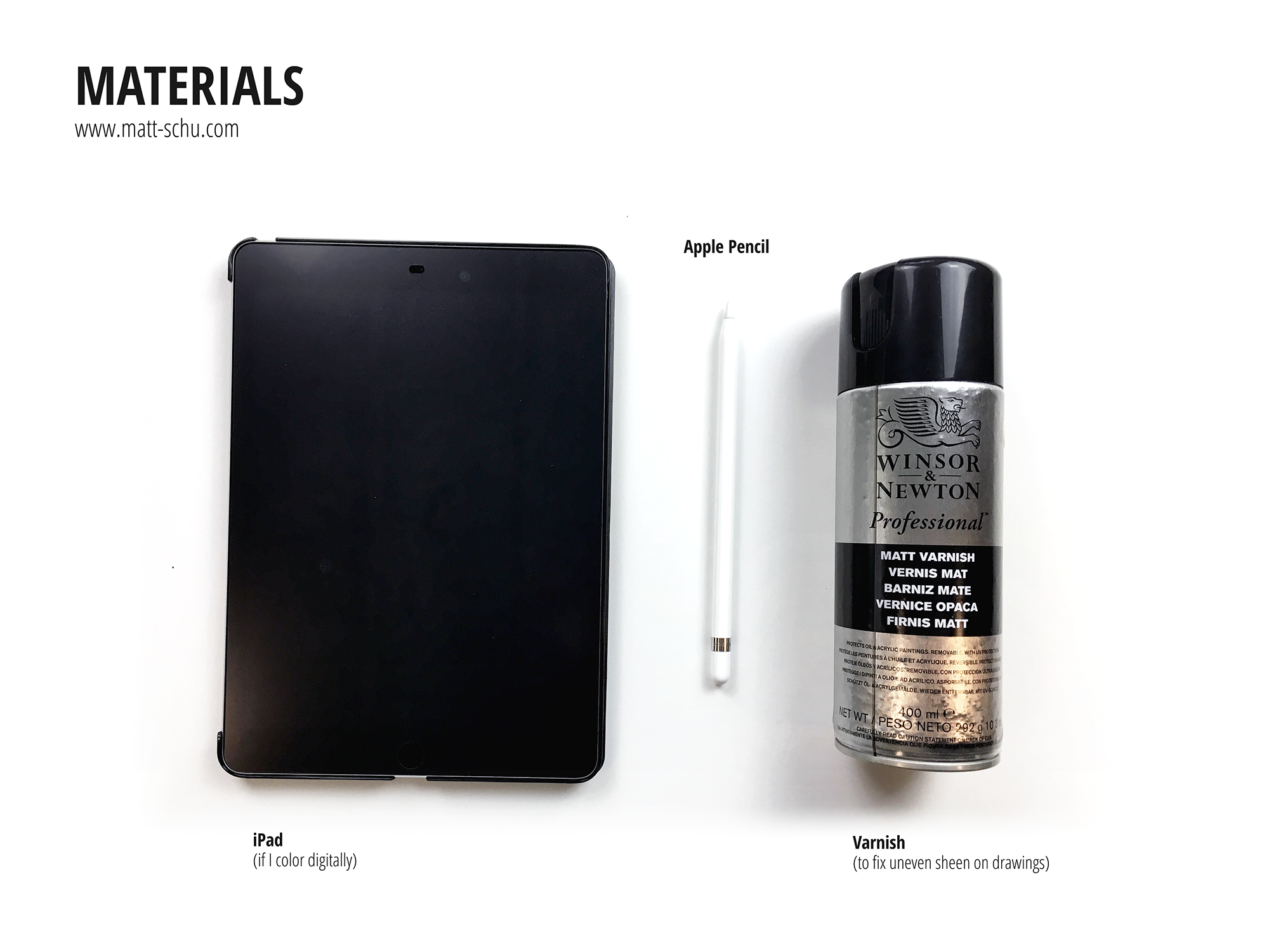
Not pictured is the Epson scanner I use. When I’m done with a drawing I’ll scan it as a 600dpi PNG and then open it in Photoshop to adjust the colors and contrast to match the real life version as much as I can. Alternately, if I planned to add color digitally, I’ll scan the grayscale ink drawing and add color in Photoshop. When I do this, I’m not concerned with making the scanned grayscale version match the real life version as much as I’m concerned with making the contrast strong. When coloring digitally, I’ll use my iPad as a drawing tablet connected to my computer. To do this I use the app Astropad.

Here’s are some random tips:

  • Windex (or generic window cleaner) works just as well as pen cleaner, if not better, for a fraction of the cost.

  • Buy masking tape at a paint store, not the art store. The paint store will have more options for way cheaper.

  • When applying the varnish, build up thin coats. If you put on too much, it can pool weirdly and leave a white powdery residue (and it’s a waste).

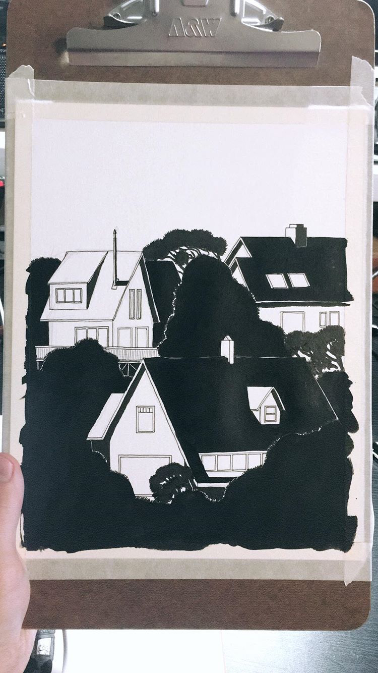
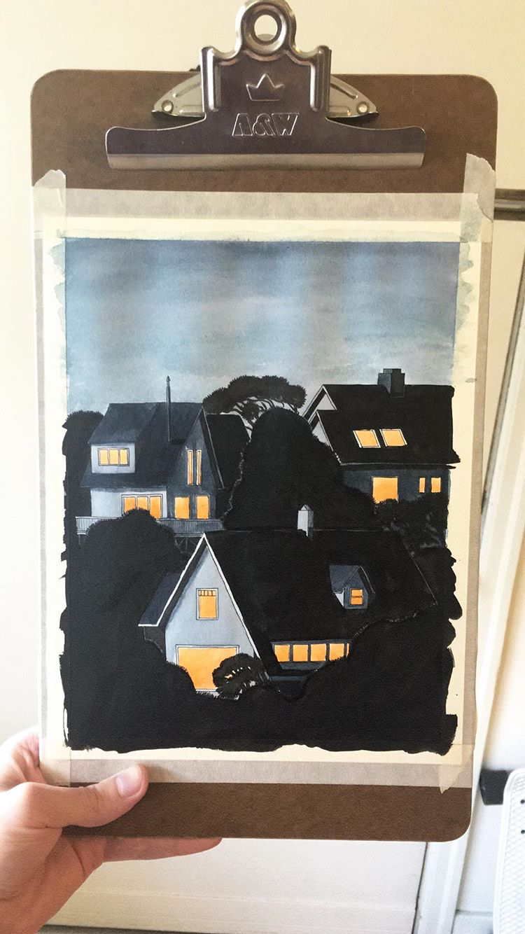
  • I apply linework and spots of black first, then add color/shading with ink. That’s why the black ink being waterproof is very important to my process.

Process Post - Caught in the Rain

Here’s a summary of my process for a recent drawing, which I’m calling “Caught in the Rain”. This is one of several drawings featuring this old man and his black cat.

I wanted to draw these characters again, and I also wanted to draw some rain. After coming up with the idea, I started with a quick thumbnail sketch (fig. 1) to make sure I liked the layout (when I draw I use Xs to indicate which areas will be filled with black).

Next I made a grayscale ink drawing on watercolor paper (fig. 2). I drew the outlines with a micron pen, then added gray tones with a series of washes of diluted black ink. After that, I added black with a brush and ink, and drew the rain with gel pens and a ruler.

Once the grayscale drawing was done, I scanned it and opened it in Photoshop (fig. 3). In Photoshop, I adjusted the black/white/gray levels to make sure the contrast looked good and had pure black and white. Then I added color with layers set to different modes (fig. 3). Overlay & Soft/Hard Light modes tint the original ink drawing below, while Multiply adds a translucent spot of color.

After this, I adjusted the color balance and saturation to make the colors look how I wanted them to. Adjusting the color balance is also a great way to unify the color palette. I use adjustment layers when I can because they give me flexibility to change things later, as they don’t edit the original drawing in a permanent way.

Anyway, then I saved the finished drawing (fig. 4) and later posted it to social media. Now I’m blogging about the process and you’re reading it. And hopefully you found this interesting or helpful in some way.

Inspiration: Photos of Artists

I like looking at photos of artists, and here are some favorites.

Inspiration: Ben Shahn

From Wikipedia:

Ben Shahn (September 12, 1898 – March 14, 1969) was a Lithuanian-born American artist. He is best known for his works of social realism, his left-wing political views, and his series of lectures published as The Shape of Content.

I love Ben Shahn’s Drawings, especially his line quality, the scratchiness and the sense of motion and immediacy. Here are some examples of his work. Every so often in my life I’d heard his name mentioned, but his work didn’t really catch my attention until a year ago when I read his book The Shape of Content. The illustrations in that book are great, and reading it prompted me to seek out more of his work.

Photos, January 2020

I recently got a new (old) camera, a Fujica Auto-M. Here are some pics I took to test it out. (Film: Kodak Gold 200)

Photos, Color, Fall 2019

Here are some photos I took in October/November 2019. I shot these on Fuji Xtra 400 color film with an Olympus OM2S.

Inktober 2019

For “inktober” this year I made at least one ink drawing every day in October (except for the 19th) and posted pics on Instagram. Now that I’ve had a chance to do some scanning, here are my favorite drawings from the month. Each one is 6x6”, ink on paper.

Photos from August 2019

More photos. Here are some from August shot on Fuji X-Tra 400 in Portland.

San Francisco Zine Fest 2019

I drove down to San Francisco at the end of August to table at the San Francisco Zine Fest, and I’m happy to say it was a successful trip. I had a a great time at the fest and also had fun walking around the city. I was only there for a few days, but I brought my camera and shot a roll of color film as I was sightseeing. Here are some pics from my drive down and from walking around the city, August 30-31.

Process Post - Shooting Star ink drawing timelapse

This is a timelapse video I recorded in November 2018. I used ink and acrylic paint for this drawing. As usual, I mixed my colors using a few primary colors of india ink and diluted them with water.

My Vimeo profile: https://vimeo.com/mattschu

Timelapse video of an ink drawing, from pencils to final version. Filmed in November 2018 in my studio in Portland, Oregon. Instagram: @mattxschu matt-schu.com © Matt Schumacher 2018

Process Post - Beach Houses at Dusk from 9-2018

Here are some process pics of an ink drawing I did last year, which I’ve called “Beach Houses at Dusk” (2018, 8x10”, ink & acrylics).

I made this with india ink and acrylics on watercolor paper. I mix the colors I use for my ink drawings from 4 main colors: aqua, magenta, yellow, & black. I dilute the color I’ve mixed with water in varying amounts and build it up gradually in layers like a watercolor painting to get the opacity I want. I also use acrylic paint to add lighter details on top of the dark areas.

This is a way of working that I’ve been doing for a little while now, but back when I made this drawing in September 2018 I was still dialing-in the process.

At the moment this is the process I use most often; for a little while I’ve been trying to use physical media as much as possible. It’s not that I never use digital methods, but I just like to keep it to a minimum when I can. I’ve fluctuated over the years with how much digital art I do, but over time I’ve found I gravitate more toward physical media, both in my own work and in the work of people I admire.

Photos, Color, July 2019

Per my previous blog post, I’ve recently taken up film photography as a hobby. Here are some color photos I took on Fuji X-Tra 400 film in July 2019 in Porltand, OR.

Photos, B&W, July 2019

Recently I got a Pentax 35mm camera and took up taking film photos. It’s been a really fun hobby so far. I get the rolls developed at a camera shop and then scan the negatives at home. Here are some photos I took on Tri-X 400 B&W film in mid-to-late July 2019, in Portland and Lincoln City, OR.

Errands - Process

Here are some process pics from a drawing I did recently. I made this digitally in Photoshop with a Surface tablet.

These are the steps shown, in order:

  1. Rough sketch
  2. Lines in-progress
  3. Finished line art
  4. Grey tones, shading, and texture added
  5. Final with color overlays